It's been a bit chilly here lately (though certainly not anywhere near what many of you are feeling!) and I decided to pull out my favorite cool weather vintage outfit.
My Ruthie blouse is a favorite all year round. It's so comfy and breaths well during the summer. In the winter, it's perfect for layering under sweaters.
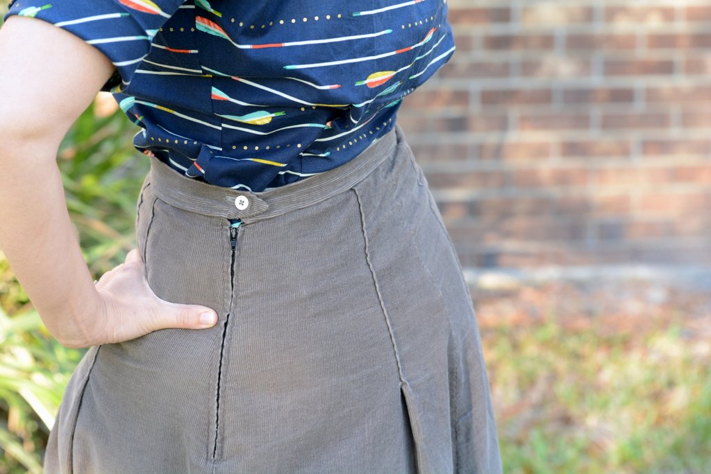
I paired it with a gray corduroy skirt that was a winter favorite from Ohio. I love corduroy for winter! It's so easy to care for and has a bit of extra warmth factor.
To winterize this outfit for colder locations, I'd add some thick tights or knee high socks and boots. Throw on your favorite cardigan and a fabulous winter jacket and you're ready to go! It's definitely possible to look cute and wear vintage in the winter. It just takes a bit more layering!
I decided to try something different with my hair since I'm stuck in the awkward grow out phase right now. I dug out one of my 1940s hair scarves and pinned up all of my hair except for my bangs. Curled under is about all my bangs can do for now so that's what I went with.
Since my bangs made my hair asymmetrical, I decided to tie the knot above my part rather than in the center as I usually wear it. It looked so cute that way! You can find a tutorial for a similar style here.
I know most of the other bloggers you follow will be posting Valentine's Day outfits today but the hubby and I are doing our Valentine's Day this evening. I did wear this cute vintage heart and key brooch as a nod to the holiday.
What I did on actual Valentine's Day is not super glamorous. Going grocery shopping, cleaning house and blogging. But such is life! Even bloggers are nonglamorous sometimes!
But if you've ever wondered what I wear for everyday life, this is it! One of the reasons that I love 1940s fashions is that they are oh, so practical for actually living life. Some other decades are much more suited to sit there and look pretty.
How was your Valentine's Day? Glamorous or quiet?
Monday, February 15, 2016
Saturday, February 13, 2016
Whatever is...
Part of my type A-ness is that I like things to match-particularly colors! So I love it when companies come out with color coordinated products. It makes me happy!
I also love having faith based products to use in my bible journaling. Somethings don't really matter like I don't care if my colored pencils have "I love Jesus" stamped on the side or "Crayola" but there are some things that are nice to have.
So I was super excited to get ahold of some of the Whatever is lovely scrapbook paper collection from Illustrated Faith and Bella Blvd. So pretty!!!
Not all of them are blatantly Christian but they do color coordinate and match really well with the products from the original Genesis collection of stickers and such from this same power duo.
There was a cute little piece that was just perfect for Philippians 4:8 so I used it as a tip in. A tip in is some sort of paper that is taped in (I used washi) to your bible. Most of the time they can flip open so you can see what is underneath.
It gives you a bit more journaling space (I snuck in verse 9 on the back) and still allows you to read the text underneath. This was my first one and I ended up really liking it. The cut out was just a bit too wide to fit in the margin but I really like where it ended up.
And I got to do a summary of verses 4-7 in the margin using a bit of acrylic, stickers, stamps and micron pens. A lot of times, I do like to copy the verse word for word in the margin but I had so much to squeeze in I decided to make a bit of a summary instead. Since I used a tip in, I can always go back to the original text at any time.
Do you like color coordinated products in your crafting or wardrobe? Or do you prefer mixing and matching your own color palettes?
Wednesday, February 10, 2016
My Konmari Journey Part #14: Kitchen-Dishes & Glasses
Today, I'm finishing up the kitchen! I decided to combine dishes, glasses and tupperware into one video because I just wanted to finish up the kitchen! It feel so amazing to have this space done. A lot of activity happens in the kitchen and it's so nice to have things moving more smoothly because there's a lot less junk everywhere.
Monday, February 8, 2016
Straight as an Arrow
I was super excited when I found out that Wearing History was coming out with a new blouse. I just adore the two that I already have. And this one has the cutest arrow print!
This Smooth Sailing blouse is quite similar to the Smooth Sailing pattern (which I have sewn up a few times for myself) but has been adjusted for a more modern body shape. It's got puffy sleeves and is much blouse-ier than the Ruthie blouse. So 1940s!
It's quite comfortable to wear and has great range of motion. I love that Lauren has really put forth and effort to make her blouses very motion friendly. It's perfect for dancers and for everyday life for that matter.
I also love the quality of this blouse! It's got darling red vintage buttons and an adorable bias pocket. :D
I paired my Smooth Sailing blouse with a grey corduroy skirt for a cute winter appropriate look. It was actually quite chilly and I was wearing a thick wool sweater when I had to be outside. But I braved the chill for photos!
My hair is at an awkward length right now. I did have an adorable navy headband that had little gold dots just like the blouse! So perfect!
Another thing I just love about this blouse is the large number of colors in the print. I've paired this blouse with a red skirt which also looks adorable but you could do yellow, green, mint or blue and it would look just as smashing. This print is quite bold but being able to mix and match with so many colors means you can get a lot of milage out of it.
Just a note on sizing: The sizing on this blouse is a bit different than any of the other Wearing History blouses. It includes plus sizes and some of the regular sizes were adjusted when the plus sizes were added. Be sure to check the size chart for this blouse before ordering. It's also quite a bit more blousey than the Ruthie blouse. And the fabric is not preshrunk and the sizing has been designed with this in mind. Lauren has included a lot of info to help you pick the right size.
For me personally, I have a large in the Ruthie and a medium in the Norma Jean and Smooth Sailing. So even if you already have a Wearing History blouse, double check the size chart to make sure you get the right size.
I'm super excited for my new blouse! It's so adorable and comfy! That's my personal secret to great vintage style-picking pieces that look polished but are just as comfortable as jeans and a t-shirt.
Friday, February 5, 2016
Grace and Faith
Today I wanted to take you along as I did some bible journaling. Recently a friend lent me some acrylic paint so I could play around with it. Lots of journalers like to apply acrylic paint with a gift card/reward card for a fun splash of color that keeps ink from bleeding and that you can read through.
The section of scripture I decided to journal on was Ephesians 2:8-9 since I had a really cute "saved by grace" stamp from Illustrated Faith. I love these verses because it really highlights one of the main differences between Christianity and other religions. Our salvation is not something that we have to work for or earn or be good enough to make it. It is a gift from God because of His grace and all we have to do is have faith!
I applied some ivory acrylic paint using a gift card and trying to stay in the margin as much as possible. (If you want a demo, check out youtube. There are quite a few good ones.) This method is a bit messy but you can apply a thin enough layer that you can read the underlying text so that's a plus for bible journaling.
Next, I laid out my acrylic stamps to get an idea of what I'd like my page layout to be. I love the clear acrylic stamps because you can see exactly where you are going to place them! I had the "saved by grace" and "faith" stamps and added in a with because that's the closet thing I had to through. In the end though, I decided to hand write through with my trusty micron pen because I just really liked the way it sounded better.
Once I had the main text on the page, it was time to embellish! Yay for embellishments. These super cute feather stamps were from the same kit as the saved by grace one so I just pulled them out and stamped in coordinating inks. Some people like to really really plan out a page and some people just fly by the seat of their pants. I feel like I fit somewhere in the middle. I do sort of plan out what I want but sometimes I just keep going until it feels right. In this case after I finished the feathers, I felt like I needed to tie in the black a bit more so I added a couple of the three triangles in black scattered on the page just to make things look a bit more cohesive.
To keep the feather stamps off of the text, I stuck down a row of post it notes along the edge of the margin as a mask. Perhaps I should have done that with the acrylics too but I didn't think of it! And I always stamp/paint/gelato/etc with some sort of scrap paper under my bible page to protect the other pages from stuff running off the edge or bleeding through.
Do you like to try new art techniques and tools or do you prefer to stick with tried and true methods?
Wednesday, February 3, 2016
My Konmari Journey Part #13: Kitchen-Baking Supplies
Today, I'm working on decluttering the kitchen. Yay for a purged, organized kitchen!! In this section, I'm going to Konmari baking pans and supplies. I used to be a big baker but now that Will is gluten free, I do a lot less baking.
Monday, February 1, 2016
Brevard County Renaissance Festival
I was so excited when I learned that a new Renaissance Festival was starting in Brevard County! I really miss the Ohio Renaissance Festival and getting to do Renaissance costuming!! So the hubby and headed out for opening day this weekend.
I decided to wear my grey wool gown since we've been having a bit of a cool spell. It was great in the morning but the day heated up more than I expected and I ended up being warm for most of the day. Seriously, the only time I get excited about cold weather is for costuming.
Will opted to wear his monk costume for the event. He's lost quite a bit if weight this past year and both of his kilts are too big. I haven't quite figured out how to take them in with all of the loops and buckles and such.
I wasn't sure what period of the Renaissance the faire was going to aim for since their website mentioned William the Conqueror, Queen Elizabeth I, the Canterbury Tales and a Knight's Tale all on the same page. Turns out it was definitely on the earlier end of things with Richard the Lionheart and Prince John and all that. (I'm thinking 12th century.)
Anyways, I decided to go for poshly middle class Elizabethan but with no sleeves. (I knew it wasn't going to be that cold!). I added in my bum roll and my nicest shirt and apron. Too bad I never finished my blackwork caul! That would have been fabulous.
Loads of people too photos of us and we did get mistaken for staff but I take that as a compliment! They did a super awesome job for this being the first time running the fair in their first year. It takes a lot of time to build up a fair to the quality of what we're used to from Ohio.
The weather the day we went was fabulous but it had been raining a lot the few days prior so it was quite muddy!!! I decided to go ahead and wear my American Duchess Stratfords. I was very impressed with how well they handled the muddy conditions. I had issues in Ohio with all of the gravel at the fair eating up the soles but they handled the mud beautifully. They needed a bit of tlc when I got home but now they are back looking good as new.
There were a lot of cool shows including the Flight of the Raptor who flew falcons and hawks for us. It was so amazing to see these beautiful birds in flight. We heard several awesome Scottish and Irish bands with bagpipes and drums. There was no SCA presence but another Renaissance/Medieval group called the Adrian Empire was there and we got to see some skilled artisans and combatants. I love meeting more nerd people.
We had a lot of fun and can't wait to see what they roll out in 2017. (They are open this weekend as well but it looks like we probably won't be making it out again.) Plus I have a whole year to work on an older period costume so I won't be to "modern"! I love playing with new periods.
Huzzah for the Brevard County Renaissance Festival!
Subscribe to:
Posts (Atom)